

Two colors, one beautiful kitchen: 6 combinations that make the whole space feel more interesting
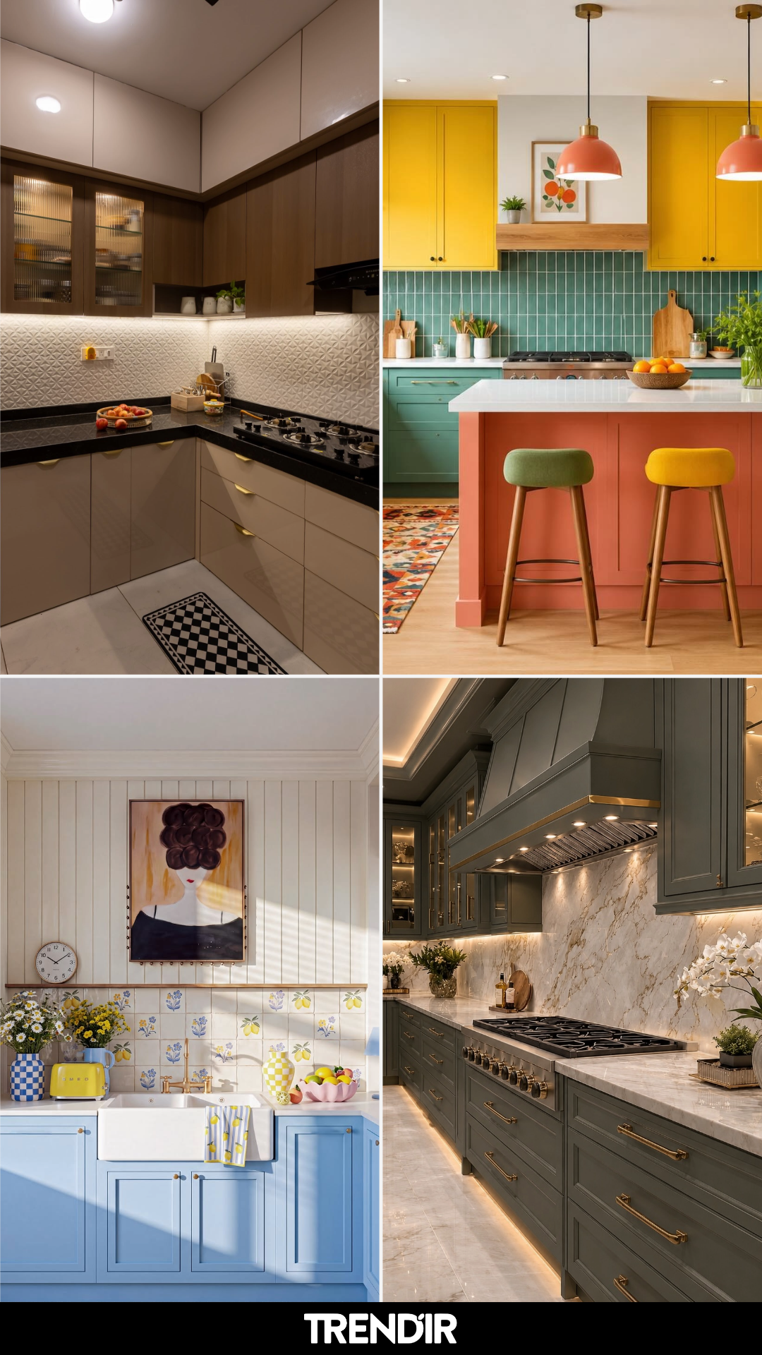
A kitchen color scheme either makes the room sing or quietly drags it down, and most of us figure that out after the paint is already on the walls. The good news: you can borrow from kitchens that got it right. These 6 kitchen color scheme ideas show you exactly what works and why.
6 Kitchen Color Schemes Worth Borrowing for Your Own Home
Color is the one thing in a kitchen that touches everything, from how the cabinets feel at 7am to how the whole room looks under warm bulbs at night. Pick wrong and you’ll fight it every day. Pick right and the room basically takes care of itself.
The schemes below cover warm, moody, bright, soft, dramatic, and clean, so there’s something here no matter what kind of home you’re working with. Save the one that stops you in your tracks.
The Scheme That Handles Low Light Without Looking Dark
This is the kitchen that proves brown doesn’t have to feel heavy. The trick is stacking cream uppers above walnut-tone lowers so the eye travels upward and the ceiling feels taller. Black granite counters anchor the whole thing, and that textured white backsplash catches every bit of under-cabinet light. If your kitchen gets limited sun, the rest of our kitchen interiors run with this exact playbook.
For the Home That Doesn’t Want to Play It Safe
Teal green, warm coral, mustard yellow, all in one kitchen, and somehow it works. The reason is balance: the greens take up the most square footage, the coral island punches once as a focal point, and the yellow uppers pull the eye to the ceiling. If you’ve been staring at beige for ten years and want something with real personality, the modern kitchen color edit is a good place to keep looking.
The Scheme That Makes Mornings Feel Lighter
Pale cornflower blue on the lowers, creamy vertical paneling above, and a hand-painted tile backsplash with little lemons and florals, this is the kitchen you want coffee in. Blue cabinets work in a sunny room because the warm cream keeps them from going cold, and the white farmhouse sink grounds everything. A yellow checkered rug on the floor ties the whole color story together without feeling forced.
When You Want the Kitchen to Feel Expensive
Dark olive green paired with Calacatta marble and warm brass hardware is the formula luxury kitchens keep coming back to. Green reads rich instead of loud, the marble veining adds movement without pattern, and brass warms the whole thing up so it doesn’t feel cold the way stainless does. Under-cabinet lighting on the toe kick is the detail most people miss, and a few more modern kitchens that lean this direction use the same lighting trick.
For the Clean Modern Kitchen That Still Has Weight
Glossy white uppers, black marble backsplash, a waterfall island that goes from pale stone on one side to dark on the other: this is contrast done well. The light strip running along the ceiling and toe kicks is what makes this look feel architectural instead of flat. If you like minimal but don’t want it to feel cold, the dark marble is the piece pulling the warmth in.
The Soft Neutral That Doesn’t Read as Boring
Warm white walls, a creamy fluted island, light oak drawers, and brushed brass fixtures: every piece here is quiet, but together they feel considered instead of plain. The fluted texture on the island and hood is what keeps the whole scheme from going flat, and the pale stone backsplash adds enough movement that the room doesn’t need pattern anywhere else. Great scheme for a bright, open space where you want the light to do most of the talking.
Which of these kitchen color schemes feels most like your home?
The post Two colors, one beautiful kitchen: 6 combinations that make the whole space feel more interesting appeared first on Trendir.