

Designers know why home pink rooms look childish, and the fix is a trick they rarely share
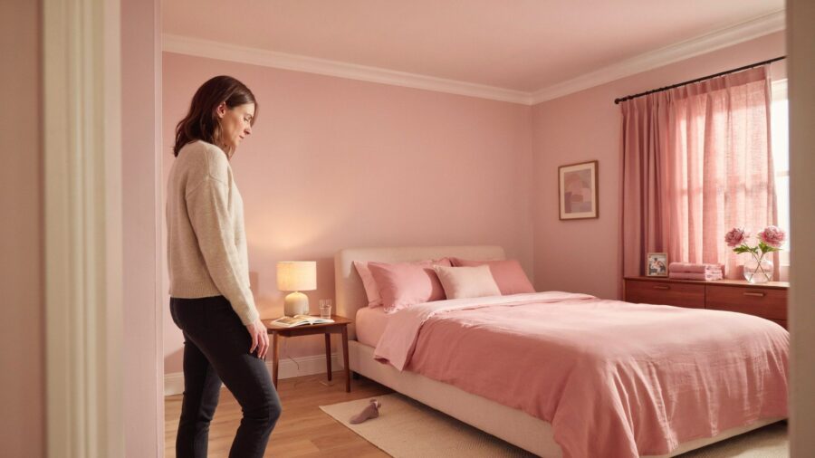
You did everything the guides told you to do. You swapped the loud Barbie pink for a softer blush. You picked a dusty rose sofa. You painted the wall a pale peach that looked so grown-up on the paint chip.
And the room still looks like a teenager’s bedroom.
Not in the fun way. In the way that makes a friend walk in and say “aw, this is cute” instead of “wow.” Cute is the word that gives it away. Cute is what people say when they mean young.
The strange part? You didn’t do anything wrong. Kathy Kuo Home literally says “pink walls read nursery,” so calming the pink down was the smart first move. Every guide on the internet gives you the same advice. Turn the volume down. Go softer. Pick a muted shade.
You did all of that. So why does the room still look like a kid picked it out?
That question is what this piece is really about, and the answer isn’t what any of those guides told you. There is a whole second step almost nobody talks about, and once you spot it, you cannot un-see it in every pretty pink room you scroll past on Pinterest.
What everyone gets wrong about “grown-up” pink
Most guides treat this like a color problem. Wrong shade? Fix the shade. Too bright? Go duller. Too warm? Go cooler.
If it really were a color problem, going soft would work. It doesn’t. You can stand in a room painted the most tasteful, expensive, French-name blush on the market, with a sofa in the exact same tone, and it can still feel like it belongs to a nine-year-old. The color is fine. Something else is off.
Think of it like a photo. If everything in a photo is bright, soft, and out of focus, it doesn’t matter how pretty the subject is, the whole picture reads dreamy and weightless. Now put one sharp, dark object in the frame. Suddenly the eye has a place to land. The photo feels serious. Grown up.
Rooms work exactly the same way. And that’s where most home pink rooms fall apart.
There’s a second layer to this that almost no home blog explains, and once someone points it out, you cannot un-see it in any pretty pink room ever again. It has nothing to do with the shade of pink you picked, and it costs almost nothing to fix. But you have to know what to look for first.
The reason your room still feels off
Walk through the pretty pink rooms you’ve saved on Pinterest. The ones that look like a Paris apartment or a magazine shoot. What are they doing that yours isn’t?
It’s not the shade of pink. Yours is probably fine. It’s not the sofa or the wall color either.
It’s what’s around the pink.
Look closely. In every one of those rooms, the pink isn’t alone. It’s sharing the room with other things doing quiet, heavy work in the background. Your room is basically pink and pink and more pink, with maybe some white and light wood mixed in. Everything is light. Everything is soft. Nothing is holding the room down.
That “everything is light” feeling is the whole problem. It’s why the room floats. It’s why it reads young no matter how carefully you picked your pink.
Interior designer Martin Horner of Soucie Horner told Homes & Gardens that a grown-up pink room needs “a classic mix of light and feminine with dark and masculine.” In plain talk: pink needs a partner in the room. A specific kind of partner. Not white. Not gray. Not more pink.
Almost every guide skips the partner part. That’s the miss.
So what are these mystery partners? Two specific things, both easy to buy, both under $500 total (about €465). One brings weight. One brings warmth. Together they turn a floating pink room into something that looks like it belongs to an adult with taste. Almost every designer-styled pink room on Pinterest has them. Yours probably doesn’t.
The two things designers actually add
The same two ingredients show up over and over in pink-room features across Homes & Gardens, 1stdibs project pages, and designer portfolios. Almost every single time.
The first is deep brown. Not tan. Not beige. Not light wood. Real, deep brown. Chocolate leather. Walnut. Tobacco. Cognac. The color of an old library or a well-worn saddle.
Horner’s team described a bedroom in that same Homes & Gardens piece where “coppery brown tones are introduced with the drapes, balanced with the palest pink tones through the soft furnishings.” He called it “a pink and brown room, but in a serene, sophisticated way, not a chocolate and bubblegum sort of way.”
Brown is what stops a room from floating. Without it, pink just drifts.
The second thing is aged brass. Not shiny new gold from a big-box store. Not chrome. Unlacquered brass, the kind that darkens on its own over time as you touch it. Nostalgic Warehouse says unlacquered brass “begins to oxidize” the day you install it and slowly builds up a “one-of-a-kind patina unique to your home.” In everyday words: it tarnishes a little. That soft tarnish is what makes a room look like a designer touched it instead of an installer.
Australian designer Greg Natale used this exact combo in his Toorak Apartment project on 1stdibs. The write-up describes “jewel-like tones of pink and maroon” mixed with “the gleam of brass” turning a soft pink space into a “grand, glamorous residence.” Same recipe: pink, plus brass, plus something deep to hold it down.
Neither brown nor brass is just decoration. They’re the reason the pink stops looking like an accident.
The ratio designers use, and how to fix your room
Designers have leaned on the 60-30-10 rule for decades. Paint brand Behr describes it this way: 60% of the room is the dominant color, 30% is the secondary color that adds depth, and 10% is the accent.
For a grown-up pink room, that means:
60% pink or blush on walls, sofa, bedding, curtains.
30% deep brown through one anchor piece and a few smaller supporting pieces.
10% aged brass in small accents scattered around the room.
Optional last touch: one small charcoal or black piece. A dark framed print, or a black candle holder. Just one. It’s the move that pushes a room from nice to magazine.
You can pull this off without repainting or replacing a thing.
Add one solid brown piece. A chocolate leather armchair. A walnut coffee table. A tobacco-colored rug. A pair of dark wood frames on one wall. One substantial piece shifts the whole room. In a small space, even a walnut side table works.
Add three to five small brass pieces. Spread them around so your eye picks up brass in more than one spot. A tray, a lamp base, a drawer pull, candle holders. If you can find unlacquered brass, grab it.
Keep the pink. It was never the real problem. It just needed company.
Budget check. Two or three well-picked pieces run about $100 to $500 (roughly €90 to €465). A thrift-store brass tray might be $8 (about €7). A mid-range chocolate leather armchair is around $400 (roughly €370). Start with the brown piece.
What changes when you do this
Same pink, same walls, same sofa. Different room. That’s the whole difference between a kid’s bedroom and a Paris apartment.
The guides weren’t wrong. They were just half the story. Softening the pink is step one. Grounding it with deep brown and aged brass is step two. Nobody tells you about step two, and that’s exactly why a room full of “right” blush choices still ends up looking like a princess set.
Sources: (1) Homes & Gardens: I never thought I would be decorating with pink and brown; (2) Kathy Kuo Home: Ooh La La, Our Guide to the French Feminine Room; (3) 1stdibs: Greg Natale, Toorak Apartment, Melbourne; (4) Behr: The 60-30-10 Rule; (5) Nostalgic Warehouse: The Enduring Allure of Unlacquered Brass Hardware.
The post Designers know why home pink rooms look childish, and the fix is a trick they rarely share appeared first on Trendir.