

28 Spring Garden Color Scheme Ideas That Make You Rethink Pairing Colors Completely
Spring is the perfect time to refresh your garden with color palettes that feel vibrant and alive. These 28 spring garden color scheme ideas are harmonious, eye-catching, and beautifully balanced perfect for creating an outdoor space that feels cohesive, fresh, and full of seasonal energy.
28 Spring Garden Color Scheme Ideas That Make Your Outdoor Space Feel Vibrant and Perfectly Balanced in 2026
In 2026, garden design is all about intentional color—using thoughtful combinations to create spaces that feel lively yet harmonious. From soft pastel blends and fresh greens to bold floral contrasts, color schemes are shaping gardens into visually stunning, well-balanced landscapes.
Whether you’re planting new beds or refreshing your existing garden, the right palette can completely transform the look and mood of your space. Ahead, discover spring garden color scheme ideas that bring together creativity, seasonal charm, and modern styling—helping your garden feel cohesive, vibrant, and beautifully designed.
1. Structured Tulip Garden Layers
There’s something so satisfying about a garden that feels both abundant and intentional. Rows of tulips in soft creams, buttery yellows, and vibrant coral reds create a layered rhythm, each bed neatly framed but still bursting with life. Against the shingled home and warm wood pergola, the colors feel even richer, like spring showing off just a little.
What makes this palette work is the balance between bold and calm. The brighter tulips draw you in, while the lighter tones soften the overall look. If you’re planting in sections like this, try grouping colors in waves instead of mixing everything together, it keeps the garden feeling elevated, not chaotic.
2. Wild Border Bloom Mix
This garden leans into that slightly untamed, just-let-it-grow energy, and it’s all the better for it. Pops of hot pink, golden yellow, and deep orange weave through lush greenery, creating a layered border that feels alive from every angle. Even the little garden statue tucked in adds a playful, almost storybook charm.
The magic here is in the contrast. Bright florals against rich green foliage keep everything grounded. Let your edges spill over a bit like this, and don’t worry about perfect spacing, a little wildness makes the colors feel more natural.
3. Soft Cottage Meadow Blend
This feels like stepping into a quiet morning, where everything is just starting to glow. Pale purples, blush pinks, and creamy whites mingle with soft greens, creating a palette that’s gentle and layered without ever feeling flat. The sunlight filtering through makes it all feel even more dreamy.
Instead of bold contrasts, this look relies on subtle shifts in tone. Think of it as watercolor for your garden, where one shade melts into the next. It’s perfect for creating a space that invites you to slow down and stay a while.
4. Playful Patio Pot Palette
This setup is pure joy in container form. Vibrant pinks, sunny yellows, rich purples, and glossy greens all sit together in textured pots that feel just as expressive as the flowers themselves. Even the turtle planter adds a little wink of personality.
What I love is how approachable this feels. You don’t need a full garden bed to create impact, just a mix of pots in different heights and finishes. Keep your colors lively but tied together with a few repeated tones so it feels collected, not crowded.
5. Warm Porch Tulip Glow
There’s a softness here that feels almost nostalgic. Peachy tulips with hints of blush and cream rise gently from a terracotta pot, catching the light in a way that makes everything feel warm and calm. Set against a simple bench and greenery, it’s understated but quietly beautiful.
This is a great reminder that a limited palette can feel just as rich. Stick to a few tones within the same family and let texture do the rest. It’s the kind of look that feels effortless, even when it’s carefully chosen.
6. Native Garden Color Harmony
This garden feels grounded, like it belongs exactly where it is. Soft whites, warm oranges, deep pinks, and muted greens all grow together in a way that feels organic rather than planned. Nothing stands out too sharply, and that’s exactly the point.
The beauty here is in the harmony. Native-style planting tends to favor colors that blend instead of compete. If you want a garden that feels calm and connected to its surroundings, lean into this kind of palette and let nature guide the combinations.
7. Classic Cottage Path Palette
Walking through this space feels like entering a painting. Lavender purples, soft pinks, and sunny yellows line the path, leading your eye straight to that charming little cottage. Every color feels intentional, but nothing feels forced.
There’s a rhythm to how the hues repeat along the path, which keeps everything cohesive. When working with multiple colors like this, echo them throughout your garden so the eye can move easily from one area to the next.
8. English Garden Romance
This palette leans fully into romance. Blush roses, cool lavender spikes, and touches of white create a layered softness that feels timeless. The stone path weaving through it all adds just enough structure to keep things from feeling too delicate.
It’s the contrast between shape and color that makes it sing. Soft blooms paired with defined pathways give the garden a sense of direction while still feeling lush and full.
9. Abundant Backyard Color Burst
This space is unapologetically full. Bright pinks, deep reds, oranges, and purples fill every corner, spilling from hanging baskets and climbing along the fence. It’s bold, energetic, and impossible to ignore.
The key to making a palette like this work is layering. Use different heights, trailing plants, and clustered blooms so the colors feel intentional instead of overwhelming. It’s a maximalist approach, but still grounded in thoughtful placement.
10. Front Porch Garden Welcome
This entryway feels like a warm hello. Soft pink roses, cheerful yellows, and fresh greens frame the path and porch, creating a palette that’s inviting without being too busy. The white fence and light exterior keep everything feeling airy.
What I love most is how balanced it feels. Bright blooms are softened by neutral elements, and nothing competes for attention. It’s the kind of color scheme that makes you want to linger just a little longer before heading inside.
11. Soft Meadow Pathway Glow
Walking up this path feels like being gently pulled into summer. Dusty pink coneflowers sway on either side, their warm centers adding just enough contrast to keep things from feeling too sweet. The muted greens and soft browns of the house in the background let the blooms take center stage without overwhelming the scene.
What makes this palette so inviting is its restraint. It leans into a single color family and lets texture do the storytelling. If you want that effortless, lived-in garden look, repeat one dominant shade and let the surrounding greenery soften the edges.
12. Blossom-Filled Garden Gathering
This is the kind of garden that feels made for long conversations and slow afternoons. A canopy of pink blossoms stretches overhead while a mix of pastels, lilacs, buttery yellows, and soft blues, fills every corner around the seating area. It feels abundant, but still somehow peaceful.
The key here is layering color without losing breathing room. Notice how the brighter hues are tucked into pockets, while softer tones carry the eye across the space. It’s lively, but never chaotic, which is exactly what you want for a gathering space.
13. Clean Garden Bed Contrast
There’s something refreshing about a garden that knows when to hold back. Crisp raised beds, deep rust-toned metal, and structured greenery set the stage, while soft pink and white blooms add just a whisper of color along the edges.
This palette leans more architectural than floral, and it works beautifully. If you prefer a more modern garden feel, keep your colors minimal and let materials and structure carry the visual weight. The result feels calm, intentional, and quietly refined.
14. Enchanted Cottage Color Blend
This one feels like a hidden garden you stumble upon and never want to leave. Pale yellows, soft purples, creamy whites, and touches of blush weave together along a winding stone path, with greenery filling in every gap like a soft backdrop.
The charm is in how loosely everything is arranged. Colors aren’t blocked, they’re scattered, allowing little moments of surprise at every turn. It’s a reminder that sometimes the most beautiful palettes feel slightly unplanned.
15. Romantic Garden Corner Retreat
Tucked into this cozy patio is a palette that leans fully into softness. Blush roses, lavender sprigs, and creamy florals wrap around warm wood furniture and brick flooring, creating a space that feels both styled and lived in.
What makes it work is the balance between florals and grounding elements. The brick and wood keep things from feeling overly delicate. Pair soft blooms with sturdy textures like this, and the whole space feels layered instead of overly sweet.
16. Monochrome Green Serenity
At first glance, it might seem like this garden is all about greenery, and it is, but that’s exactly the point. Layers of fresh greens, from deep leafy tones to soft chartreuse, create a calming, almost meditative palette.
This kind of scheme is perfect when you want your garden to feel restful. Instead of chasing color, focus on shape and texture. It’s proof that a garden doesn’t need blooms everywhere to feel full and intentional.
17. Soft Lavender Field Layers
There’s a quiet elegance in this sea of soft purples. Slender stems rise above lush green foliage, with delicate lavender blooms creating a haze of color that feels light and airy rather than bold.
It’s a palette that relies on repetition and simplicity. When you keep the color story tight like this, the effect feels cohesive and calming. Perfect for spaces meant for unwinding, not overstimulation.
18. Early Spring Pop Contrast
This little patch feels like the first cheerful sign that winter is finally over. Bright yellow daffodils and tiny violet crocuses peek through dark soil and fallen leaves, creating a contrast that feels fresh and full of life.
What I love here is how minimal it is. You don’t need a full garden to create impact, just a few well-placed bursts of color against a neutral backdrop. It’s simple, but it feels like a celebration.
19. Garden Center Color Story
Rows of plants in varying greens, deep burgundies, and hints of red and pink create a palette that feels curated even before it’s planted. The structured layout makes it easy to imagine how these tones could come together in a finished garden.
Think of this as your color planning stage. Mixing foliage shades with subtle blooms adds depth before flowers even fully arrive. It’s a great reminder that color in a garden starts long before things begin to bloom.
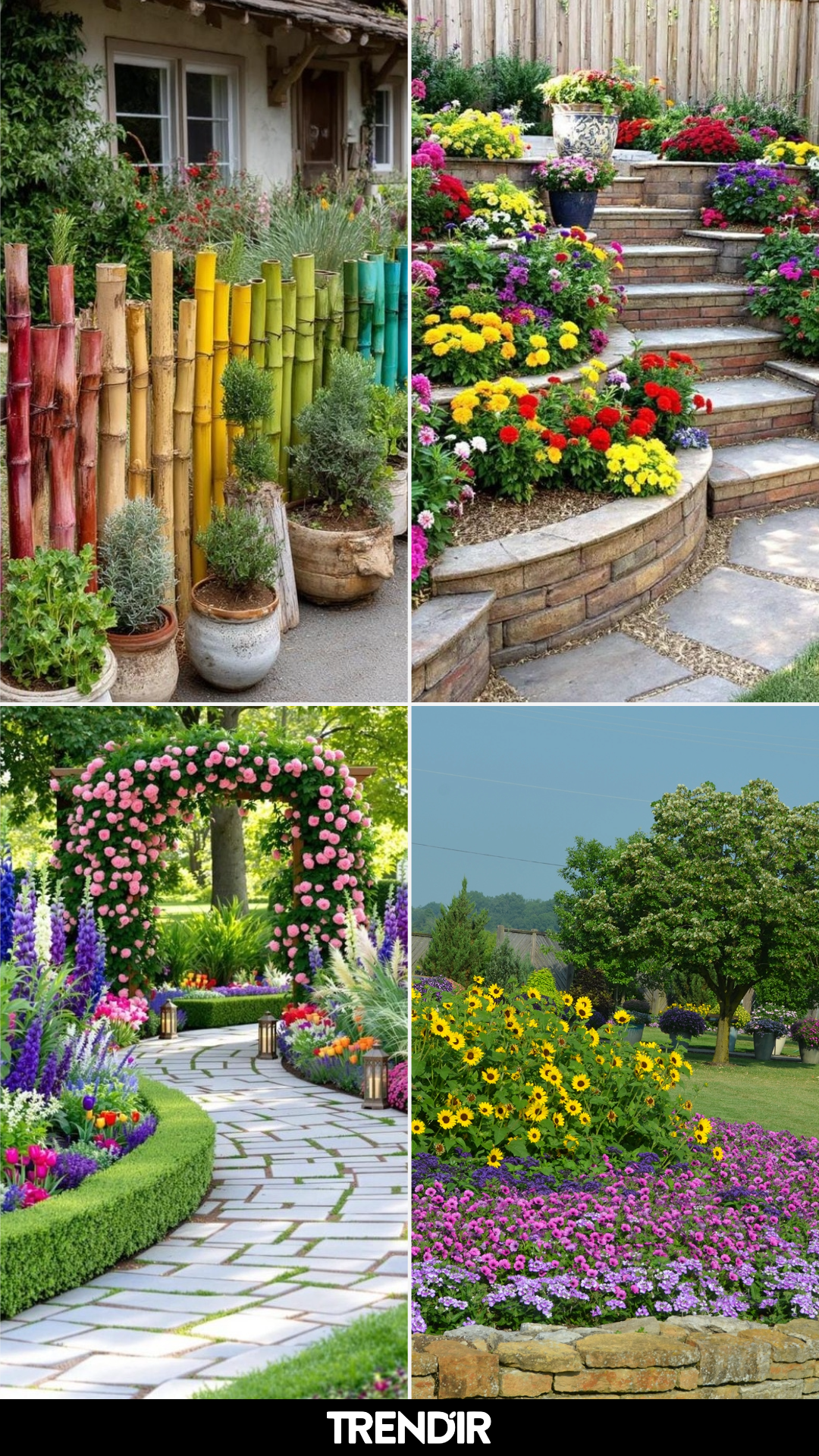
20. Tiered Flower Bed Color Cascade
This space doesn’t hold back, and honestly, it doesn’t need to. Bright reds, sunny yellows, vibrant pinks, and deep purples spill across tiered stone beds, creating a cascading effect that feels energetic and full of movement.
The structure keeps it from feeling overwhelming. Each level holds its own color moment, allowing your eye to travel without getting lost. If you love bold palettes, this is how you do it, let structure bring the balance.
21. Garden Archway Color Symphony
This path feels like stepping into a storybook. A soft stone walkway curves beneath a rose-covered arch, while vivid purples, crisp whites, and pops of coral and yellow line the edges like a perfectly arranged border. The greenery keeps everything grounded, letting each color shine without competing.
What makes this palette work is the framing. The arch draws your eye forward, while the layered blooms guide you along the way. It’s a reminder that color feels even richer when it’s paired with structure and a clear sense of direction.
22. Wildflower Meadow Mix
This garden leans into that untamed, just-let-it-grow energy. Bright pink coneflowers, golden daisies, and clusters of soft lavender tones mingle freely, creating a palette that feels spontaneous and alive.
There’s no strict pattern here, and that’s exactly the charm. Mixing bold and soft hues in a loose layout gives you that natural meadow feel. It’s less about precision and more about letting colors bump into each other in the best way.
23. Classic Spring Border Palette
Clean lines meet cheerful color in this beautifully edged garden path. Red tulips, sunny daffodils, and cool blue irises are tucked into neatly trimmed borders, creating a palette that feels both traditional and fresh.
The structure keeps the bold colors from overwhelming the space. If you love a more polished look, this is the formula, pair classic spring hues with crisp edging so everything feels intentional and easy to read.
24. Playful Rainbow Garden Edge
This one doesn’t take itself too seriously, and that’s what makes it fun. A rainbow-toned fence runs along the edge, echoing the surrounding greenery while adding an unexpected burst of color that feels almost artistic.
It’s a great reminder that not all color has to come from flowers. Painted elements, planters, or even furniture can carry your palette and give your garden personality without adding more plants.
25. Warm Sunset Tones Border
There’s a warmth here that feels like late afternoon light captured in plant form. Rusty oranges, deep reds, and muted greens blend together in a way that feels cozy rather than bright.
This palette leans slightly away from traditional spring pastels and into something more grounded. If you want your garden to feel calm and earthy, warm tones like these create depth without demanding attention.
26. Cottage Garden Color Burst
This is cottage garden energy at its fullest. Pink foxgloves rise tall, golden blooms scatter through the middle, and soft purples weave everything together in a layered, slightly overgrown mix.
The beauty here is in the density. Colors overlap, heights vary, and nothing feels too spaced out. It’s a great approach if you want your garden to feel lush and immersive, like you’re walking through it rather than just looking at it.
27. Whimsical Garden Decor Pop
Bright yellow metal flowers stand tall among green cactus shapes and rustic textures, creating a palette that feels playful and unexpected. It’s less about natural tones and more about curated bursts of color.
This kind of styling works when you want personality. Mixing garden art with real greenery adds contrast and keeps things from feeling too traditional. It’s bold, but in a way that still feels approachable.
28. Bold Sunflower & Petunia Contrast
This garden doesn’t hold back on color, and it pays off. Golden sunflowers stretch upward while rich pink and violet petunias spread across the base, creating a layered contrast that feels vibrant and full.
What makes it work is the balance between height and ground cover. Tall, statement blooms paired with dense, colorful layers underneath create a complete, finished look. It’s bright, but still beautifully composed.
The post 28 Spring Garden Color Scheme Ideas That Make You Rethink Pairing Colors Completely appeared first on Trendir.