

Most bathrooms stop at clean and tidy: this one detail makes them look far more expensive
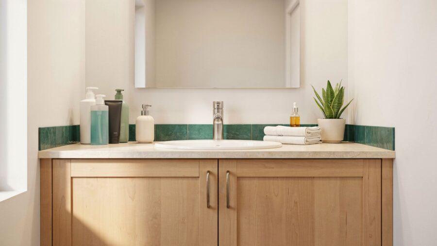
You did what every organizing article told you to do. You pulled the backup toilet paper off the open shelf. You moved the extra shampoo bottles into a drawer. You hid the pile of half-used lotion samples inside a cabinet. The shelf looks clean. The counter looks clean. The bathroom is officially “tidy.”
And somehow it looks worse.
Not worse the way a mess looks worse. Worse the way a hotel room looks the second you walk in, before anyone has stayed in it. Empty. Bare. A little sad. Like the room forgot to finish getting dressed.
If that’s your bathroom right now, you’re not doing anything wrong. You’re doing exactly what most cleaning and organizing articles told you to do. The problem is that all those articles stop at the same place, and there’s a second step almost none of them mention. It’s the reason a bathroom in a home magazine and your just-cleaned bathroom look nothing alike, even when yours is technically the cleaner one.
Why “clean and tidy” ends up looking cheap
Pull up any bathroom photo you’ve saved from a design magazine, a boutique hotel listing, or a real estate agent’s staging shots. Every one of them looks calm. Not empty. Calm.
There’s a difference, and designers see it right away. A cleared shelf with nothing on top of it doesn’t read as minimal. It reads as unfinished. Your brain looks at a bare shelf and doesn’t think “peaceful.” It thinks “someone moved out.” Your eye needs something to land on, or the whole room feels off.
Interior designer Sarah Gibson, writing for the design site Room for Tuesday, describes a boutique-hotel bathroom as one built with “layered comforts” that are both useful and nice to look at. Not stripped bare. Layered.
The bathroom brand Peacock Alley, which sells linens to real luxury hotels, describes the same move in its own decorating guide: build a small cluster around a hand towel and a washcloth, then add a candle, a bar of soap, and maybe one pretty extra, and let that little cluster be the styled moment for the whole shelf.
The Spruce, in a piece with three working designers on how to make a bathroom look expensive, quotes designer Heather Knight-Willcock recommending small styling pieces like a nice tray as one of the “no-reno-needed” upgrades that instantly reads high-end. The tray itself isn’t the point. The point is that something on purpose is sitting on the surface you just cleared. Empty isn’t the finish line. Empty is halfway.
What every boutique bathroom actually puts on the shelf
So what goes back on the shelf?
There’s a real formula behind the styled shelves you keep saving to Pinterest, and it isn’t “add some decor.” It’s a small rule with a very short shopping list, and it works whether your bathroom is huge or the size of a closet.
Before the recipe, one thing to notice about those Pinterest photos. Look closely at any of them and you’ll see the same trick, over and over: the shelves are never full, but they’re never bare either. The items on them are always in odd numbers. The tallest thing is always at the back or the side, never the middle. The colors always match. It looks casual, but it isn’t. Somebody made every one of those choices on purpose.
The bathroom design site Badeloft lays out the rule this way: every flat surface gets exactly one grouping, and that grouping should follow “the stylists’ rule of three.” Odd numbers of objects. Different heights. One grouping per surface. Pairs and neat little rows, they point out, read as storage, not as styling. That one rule is why a boutique bathroom shelf never looks like a store display and never looks like a junk drawer.
Once you know the rule, you can stop guessing at every shelf and follow the same recipe. Everything below assumes you’re styling one shelf at a time. If you have three open shelves, you build the same recipe three times, in the same color family each time.
The one-shelf fix, step by step
For every open shelf you cleared, you’re going to add one grouping of three to four items, all in a matching color family. That’s the whole job. No renovation, no new furniture. About 15 minutes to style, and a one-time buy in the $50 to $150 range (roughly €45 to €140) depending on what you already own.
You don’t have to hit every single item on the list below. Three is enough. Four is the ceiling.
1. A short stack of two or three rolled hand towels. Rolled, not folded. Rolling adds texture and a little height, which is what your eye needs. Stick to one neutral color: white, oatmeal, soft gray, warm sand. Turkish cotton or waffle-weave, $15 to $35 (about €14 to €32) at places like Target, Quince, or Parachute. Room for Tuesday’s designer guide points to plush neutral towels (crisp white, soft gray, or oatmeal) as the fastest boutique-hotel upgrade you can make. Matching matters. Two mismatched towels read as laundry. Two matching towels read as styling.
2. A small woven basket or ceramic bowl with rolled washcloths inside. This gives the shelf a second texture (woven or matte ceramic against soft cotton) and a spot for the tiny stuff to sit without looking like tiny stuff. Budget $15 to $40 (about €14 to €37). Amazon, HomeGoods, Target, or a local shop. Keep the color in your neutral family.
3. One candle in a jar that matches the palette. Not a bright-red novelty candle. One candle in a plain vessel: clear glass, matte ceramic, or amber. The bathroom candle roundup on TheCoolist makes the point that a single candle plus one natural element (dried stems, fresh greenery, or a folded towel) is often the whole styling job. The candle is your anchor. It’s the tallest thing on the shelf and the one that catches the light.
4. A small tray with one accent object on it. A brass, wood, or ceramic tray, about 6 to 8 inches (15 to 20 cm) wide, holding a single stem in a small bud vase (dried grass or a piece of eucalyptus works fine, and you don’t have to swap it out), plus one nicely wrapped bar of soap or a small pump for hand lotion. The tray is what turns three separate things into one designed moment instead of three random things sitting near each other.
That’s the whole formula.
Two rules that keep it from looking like a store display
Two mistakes turn a nice grouping right back into clutter.
Never more than four items on one shelf. The pause between objects is the point. A fifth thing is where “styled” tips into “cluttered.” If you’re adding a fifth, take one off.
Every item stays in one color family. Pick a palette (soft neutrals, warm woods with brass, or cool whites with charcoal) and don’t sneak in a bright color or a shiny chrome piece. The bathroom write-up from Constrofacilitator sets the ceiling at “two or three complementary colours” plus one accent shade, kept the same across your towels, decor, and small accessories. That one habit is the difference between a spa shelf and a yard sale.
Do this on every shelf you cleared and the bathroom stops looking like a room you tidied and starts looking like a room someone designed. The clutter is still gone. The blank is gone too. What’s left is the boutique feeling your bathroom was missing.
The organizing guides stop at “put it away.” Boutique bathrooms take one more step, and now you’ve got the recipe for that step.
Sources: (1) Room for Tuesday, How to Style a Bathroom That Feels Like a Boutique Hotel; (2) The Spruce, Designers Gave Us These 8 Tricks to Instantly Make Any Bathroom Look More Expensive; (3) Peacock Alley, 8 Bath Towel Décor Ideas for Your Home; (4) Badeloft, How to Decorate a Bathroom: Subtract First, Then Add Three Layers; (5) TheCoolist, 20 Bathroom Candle Display Ideas; (6) Constrofacilitator, How to Create a Bathroom That Feels Like a Boutique Hotel (On a Budget).
The post Most bathrooms stop at clean and tidy: this one detail makes them look far more expensive appeared first on Trendir.