

23 Floral Color Palette Spring Decor Ideas That Turn Small Color Shifts Into Big Visual Changes
Ready to brighten your space with the beauty of blooming colors? These 23 floral color palette spring decor ideas are vibrant, fresh, and uplifting perfect for creating a cheerful, coordinated look that brings the essence of spring indoors.
23 Floral Color Palette Spring Decor Ideas That Feel Fresh, Vibrant, and Beautifully Curated in 2026
In 2026, floral color palettes are redefining spring décor with soft pastels, romantic hues, and nature-inspired combinations that instantly brighten your space. Think blush pinks, lilac tones, buttery yellows, and fresh greens layered in a way that feels both lively and harmonious.
In this list, you’ll discover creative ways to bring floral-inspired colors into your home—from subtle accents to full, coordinated looks. Whether you prefer a soft and delicate vibe or something more bold and playful, these ideas will help you create a space that feels fresh, uplifting, and effortlessly styled—let’s explore.
1. Garden Crate Charm
There’s something quietly nostalgic about this arrangement. Soft peach roses, creamy whites, and a hint of powdery blue rise from a simple wooden crate, like something gathered from a morning garden walk.
And that tiny butterfly detail feels like a whisper of whimsy. It keeps the palette from feeling too polished, adding just enough story to make the whole piece feel personal, not staged.
2. Pastel Cloud Bouquet
This one feels like spring in full bloom, almost dreamlike. Layers of blush, apricot, lilac, and soft butter yellow blend together in a way that feels airy rather than busy.
What makes it work is the balance. Nothing dominates, everything floats, like a watercolor that never quite settles but still feels complete.
3. Soft Ivory Tablescape
This palette leans into restraint, and it pays off. Creamy roses, delicate petals, and barely-there greens create a look that feels refined without trying too hard.
It’s the kind of setup that lets texture do the talking. Ruffled edges, soft layers, and candlelight bring warmth without adding color noise.
4. Rustic Spring Gathering
This long table feels like a celebration that unfolds slowly. Natural wood, woven textures, and a relaxed floral runner create a palette that feels sun-washed and grounded.
There’s an ease to it all. Nothing feels overworked, and that’s exactly why it feels so inviting.
5. Garden Party Romance
Soft draping, warm light, and a floral center that feels freshly picked. This palette leans into blush, peach, and gentle greens, all softened by the setting.
It’s romantic without feeling overly delicate. The natural textures overhead keep it grounded, giving the florals room to glow.
6. Mantel in Bloom
This arrangement stretches like a garden climbing across the mantel. Pastel tones weave through soft greens, creating movement rather than a fixed focal point.
And that’s what makes it feel alive. It’s not just placed, it’s growing, spilling, shifting, like it belongs there.
7. Citrus Garden Mix
Here, color steps forward just a bit more. Bright yellow, coral, and soft lavender play together in a way that feels cheerful but still curated.
The key is the mix of shapes. Loose stems and varied blooms keep the palette from feeling too sweet.
8. Modern Spring Cluster
These smaller arrangements feel playful and fresh. Pops of orange, violet, and green create little moments of color across the table.
It’s less about one centerpiece and more about rhythm. The repetition makes the whole space feel layered and alive.
9. Courtyard Bloom Wall
This setup feels like a hidden garden tucked into a city corner. Rows of flowers line the space, softening the brick and adding a sense of quiet charm.
The palette leans warmer here, with yellows and pinks catching the light. It turns a simple backdrop into something that feels almost cinematic.
10. Effortless Spring Tablescape
This table strikes that perfect balance between styled and relaxed. A soft sage runner grounds the look, while bright florals add just enough contrast to keep things interesting.
And those tinted glasses bring in a subtle play of color without competing. It’s the kind of table that feels thoughtful, but never overdone.
11. Peach Garden Classic
This bouquet feels like spring at its most timeless. Peach roses, soft blush carnations, and tiny white daisies come together in a palette that feels warm without being heavy.
There’s a quiet richness to it, especially against that wooden backdrop. It’s the kind of arrangement that doesn’t chase trends, it just settles in and feels right.
12. Bridesmaid Color Story
A row of bouquets, each one slightly different, but all speaking the same language. Soft yellows, coral tones, and hints of blue play beautifully against those airy dresses.
It’s the layering that makes this feel elevated. Nothing matches too perfectly, and that’s exactly why it feels modern.
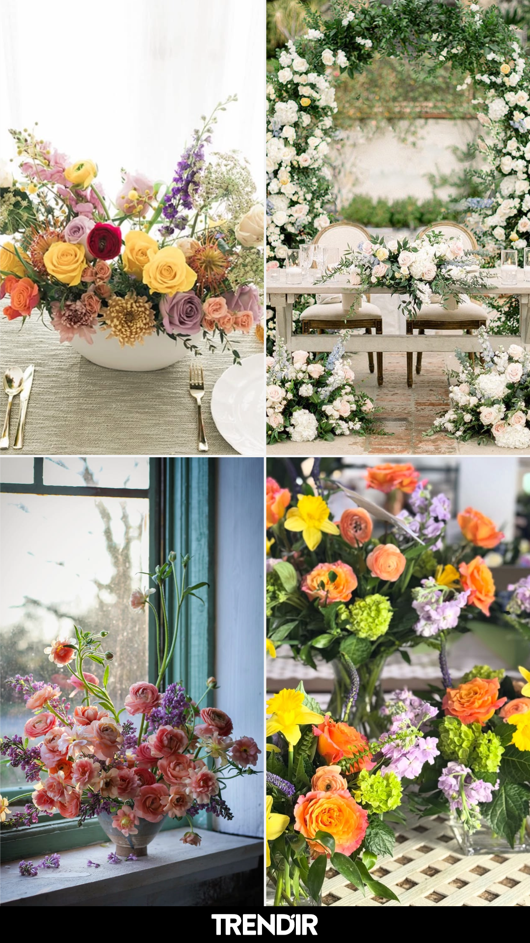
13. Bright Garden Table
This palette leans joyful in the best way. Pops of yellow, lilac, coral, and soft pink create a centerpiece that feels full of movement and light.
And yet it still feels composed. The low bowl keeps everything grounded, letting the color shine without overwhelming the table.
14. Desert Garden Ceremony
Set against palms and sun-washed stone, these florals feel like they belong to the landscape. Bright clusters line the aisle, guiding the eye toward a softly decorated backdrop.
There’s something cinematic about it. The colors don’t compete with the setting, they echo it, adding life without taking over.
15. Sunlit Cottage Arrangement
This one feels personal, like something gathered and placed without overthinking. A mix of pinks, peaches, and buttery yellows sits casually in a patterned pitcher.
The light does half the work here. It filters through the window, catching each petal just enough to make the whole scene feel calm and lived-in.
16. Soft Glam Table Moment
Delicate details take center stage here. A blush tulip leans gently beside a warm-toned candle, layered over a textured linen that feels almost weightless.
It’s subtle, but intentional. The palette stays soft, while the textures add just enough interest to keep your eye moving.
17. Bold Garden Arch
This is where color steps forward with confidence. Bright pinks, oranges, purples, and greens spill across the arch in a way that feels lush and full.
But it never feels chaotic. The structure keeps it anchored, letting the color feel expressive, not overwhelming.
18. Window Light Florals
There’s a quiet poetry to this arrangement. Coral and blush blooms stretch upward, catching soft light from the window beside them.
It feels almost still, like a moment paused. The palette stays gentle, letting shape and light carry the mood.
19. Casual Spring Table
A simple table, a soft runner, and a loosely gathered bouquet. The mix of pinks, blues, and fresh greens feels easy and unfussy.
It’s the kind of setup that works for a slow lunch or an impromptu gathering. Nothing feels staged, and that’s what makes it so inviting.
20. Garden Texture Mix
This arrangement leans into texture over color saturation. Soft greens, muted pinks, and layered petals create a palette that feels calm and slightly undone.
And that’s the charm. It doesn’t try to be perfect, it just feels like it grew that way.
21. Bold Spring Contrast
This arrangement doesn’t whisper, it walks in with confidence. Hot pinks, fiery reds, and bursts of orange play against that moody backdrop, creating a palette that feels modern and a little unexpected for spring.
What makes it work is the balance. Eucalyptus softens the intensity, giving your eye a place to rest. It’s bold, but still grounded, like a statement piece you can actually live with.
22. Romantic Garden Arch
This scene feels like stepping into a storybook. Layers of creamy whites, soft blush, and touches of pale blue wrap around the arch and spill gently onto the ground.
There’s a softness here that feels intentional, not overly styled. The palette leans classic, but the loose arrangement keeps it feeling fresh and current.
23. Soft Peach Minimal
A single cluster of blooms, slightly blurred at the edges, creates a moment that feels intimate and quiet. Peach ranunculus and ivory roses blend into a palette that feels warm without demanding attention.
It’s the kind of floral styling that works for slow dinners and candlelight. Nothing overdone, just thoughtful color and soft shapes doing exactly what they need to.
The post 23 Floral Color Palette Spring Decor Ideas That Turn Small Color Shifts Into Big Visual Changes appeared first on Trendir.