

Choosing the right color can completely change how your living room feels the moment you walk in. These 29 living room colors are warm, versatile, and endlessly inspiring ranging from soft neutrals to bold statement shades that set the tone. Whether you want cozy, modern, or dramatic, these color ideas help you create a space that feels welcoming, stylish, and truly lived-in.
29 Living Room Colors That Set the Tone for Stylish Homes in 2026
Living room color trends in 2026 are all about mood—shades that feel warm, intentional, and perfectly suited to everyday living. From calming neutrals to bold statement hues, color is being used to shape how spaces feel, not just how they look.
Whether you’re refreshing a single wall or rethinking your entire palette, the right color choice makes all the difference. Explore these living room color ideas for inspiration that helps you create a space that feels current, cohesive, and effortlessly inviting.
1. Soft Neutral Layers
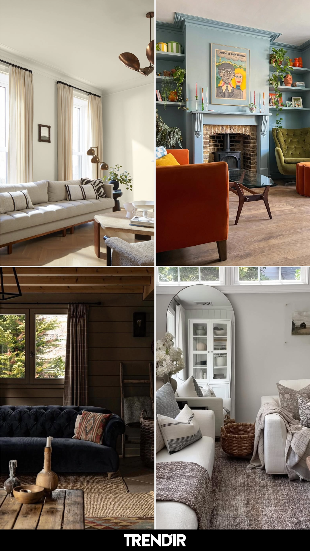
This living room feels like a deep exhale. Creamy whites, gentle greige, and barely-there taupes layer together in a way that feels calm but never flat. The textures do most of the talking—linen sofas, woven baskets, and that cozy rug grounding everything just enough.
What really works here is how the palette lets light bounce around the room. It’s the kind of space that feels equally right at golden hour or on a quiet, cloudy afternoon—timeless, relaxed, and quietly inviting.
2. Moody Green Moment
This green is confident. Deep, saturated, and just dramatic enough, it wraps the room in a sense of intention without tipping into heavy. Paired with dark wood and classic silhouettes, it feels polished but still warm.
It’s a great reminder that color doesn’t have to shout to make a statement. Sometimes all it takes is one perfectly chosen shade—and this one absolutely earns its moment.
3. Layered Blue Elegance
There’s something incredibly grounding about this blue. It’s rich without being overpowering, creating a backdrop that instantly makes the room feel collected and thoughtful. The tailored drapery and structured furniture keep it refined.
I love how the color gives everything else permission to shine—from art to textiles to those subtle metallic accents. It’s classic, but with enough depth to feel current.
4. Warm Blue with a Twist
This space plays with blue in the most unexpected way—softened by warm accents and layered patterns that keep it from feeling too formal. The color feels livable, not precious, which is always the goal.
It’s the kind of room where you could host guests and still curl up with a book later. That balance between beauty and ease is what makes the palette work so well.
5. Sunlit Coastal Neutrals
Here, color takes a step back and lets light do the heavy lifting. Soft sands, warm whites, and gentle wood tones create a palette that feels breezy and effortless. Nothing feels forced—and that’s exactly the point.
It’s coastal without being themed, relaxed without being unfinished. A reminder that sometimes the best color choice is knowing when to keep things quiet.
6. Deep Blue Library Feel
This is blue with purpose. Saturated walls paired with built-ins create a cocooning effect that feels intimate and sophisticated. It’s moody, but still inviting—thanks to warm brass and layered lighting.
The color choice makes the room feel like a destination, not just a pass-through. Perfect for long evenings, slow conversations, and shelves filled with stories.
7. Classic Cream Comfort
This palette is all about ease. Soft creams and warm neutrals set the stage for a living room that feels familiar in the best way—welcoming, timeless, and endlessly adaptable.
What makes it work is the balance: nothing feels too precious, yet everything feels considered. It’s the kind of room that grows with you, season after season.
8. Dark and Cozy Contrast
Dark walls instantly change the mood, and here they do it beautifully. Paired with plush seating and lighter accents, the color feels cozy rather than closed in. It’s bold, but still livable.
This space proves that darker shades can be incredibly inviting when balanced with softness. Think movie nights, candles lit, and zero rush to be anywhere else.
9. Tailored Neutral Warmth
Warm neutrals take center stage here, creating a room that feels polished yet personal. The palette leans classic, but layered textures and thoughtful styling keep it from feeling stiff.
It’s the kind of space that feels instantly settled—like it’s been loved and lived in for years, even if it’s brand new.
10. Bright, Collected Calm
This living room keeps things light and airy, with soft hues that make the space feel open and calm. The color palette stays neutral, but subtle contrast gives it depth and interest.
It’s effortless in the way the best rooms are—nothing overdone, nothing missing. Just a beautifully balanced space that feels good to walk into, every single time.
11. Soft & Sunlit Neutrals
This living room is proof that light neutrals never get old. Creamy walls, pale upholstery, and just enough soft blue to keep things from feeling flat—it’s calm without being sleepy.
What really works here is how everything feels easy. Nothing is trying too hard, and that’s exactly why it feels welcoming. The kind of space that looks good at golden hour and still feels cozy on a cloudy day.
12. Warm Modern Farmhouse
Same creator, totally different mood. Exposed beams, earthy neutrals, and black-framed doors give this room quiet confidence.
It’s grounded, cozy, and a little dramatic without crossing into heavy. The kind of living room that makes you want to cancel plans and stay in—with good lighting, obviously.
13. Moody Blue Elegance
This blue is rich, layered, and unapologetically grown. Paired with soft grays and sculptural lighting, it feels refined but still livable.
And let’s talk about the balance here—moody walls, light furniture, zero overwhelm. It’s a masterclass in how to go dark without losing warmth.
14. Earthy Green Comfort
Muted green walls bring instant calm to this space. Mixed with warm wood floors and soft textiles, it feels grounded in the best way.
This room doesn’t shout for attention—it settles you. It’s the kind of color choice that quietly grows on you until you can’t imagine the space any other way.
15. Classic Cream Done Right
Soft, warm cream walls set the stage for a living room that feels timeless and fresh at the same time. Nothing icy, nothing yellow—just that perfect in-between.
It’s the kind of backdrop that lets furniture, art, and light do the talking. Understated, elegant, and endlessly flexible.
16. Deep Teal Drama
This teal is bold, moody, and absolutely intentional. It wraps the room in depth while letting warm accents shine.
What I love most is how confident it feels—like the room knows exactly what it’s doing. Not for the faint of heart, but so worth it when done right.
17. Rich Burgundy Statement
Dark red walls done this well feel luxe, not loud. The color is deep, warm, and perfectly balanced with soft textures and neutral furniture.
It’s dramatic without being intimidating—a reminder that bold colors can still feel inviting when styled thoughtfully.
18. Calm Blue-Gray Balance
This blue-gray hits that sweet spot between cozy and polished. It cools the room just enough while warm accents keep it from feeling sterile.
It’s approachable, timeless, and incredibly livable. The kind of color you won’t get tired of five years from now.
19. Layered Neutrals with Texture
Soft taupes and greiges take center stage here, but texture is the real hero. From pillows to rugs, everything adds depth without adding noise.
This is neutral done the interesting way—quiet, layered, and effortlessly cozy.
20. Deep Green Modern Edge
Dark green walls bring a bold, modern edge while still feeling grounded and warm. Paired with clean lines and soft furnishings, it strikes a perfect balance.
It’s confident, contemporary, and a little unexpected—in the best way. Proof that color can be strong and sophisticated at the same time.
21. Pattern-Soft Traditional
This room feels like a deep breath. The layered patterns—especially that tailored Roman shade—add just enough visual interest without tipping into busy. It’s classic, but relaxed, like a well-loved novel you keep on the side table.
What really works here is the quiet confidence. Nothing is shouting for attention, yet every piece feels chosen. Proof that soft neutrals and traditional details can still feel fresh when handled with care.
22. Moody Heritage Moment
Dark walls, antique accents, and that perfectly worn rug—this space leans all the way into its old-soul energy. It feels intimate and collected, like a room that tells stories after sunset.
And somehow, it doesn’t feel heavy. The balance of light furniture and warm metallics keeps it grounded. It’s the kind of room that makes you want to sit longer than planned.
23. Modern Calm with an Edge
This is minimalism done right—clean lines, muted tones, and just enough drama in that sculptural lighting. Everything feels intentional, from the low profile furniture to the subtle texture play.
It’s calm without being cold. The space feels like it knows exactly what it’s doing and doesn’t need to prove it. Effortless, but very precise.
24. Classic Comfort, Lived-In
There’s something incredibly inviting about this setup. Slipcovered sofas, layered rugs, and just enough color to keep things from feeling flat—it’s comfort-forward in the best way.
You can tell this room is meant to be used, not just admired. It feels like Sunday afternoons, fresh flowers on the table, and no rush to be anywhere else.
25. Cozy Americana Charm
Same designer, different mood—and it works. This room leans into warmth with leather seating, deep wall color, and those heritage-inspired details that feel timeless.
It’s cozy without being themed, nostalgic without feeling dated. The kind of space that feels better the longer you live in it.
26. Polished Contemporary Living
This space is crisp, modern, and beautifully restrained. The symmetry, the tonal palette, the clean architectural lines—it all feels very intentional and very refined.
Yet it doesn’t feel untouchable. The softness in the furnishings keeps it approachable, making it a space that looks impressive but still livable.
27. Colour with Confidence
This room is a masterclass in bold done right. The color isn’t just paint—it’s atmosphere. Paired with sculptural furniture and playful accents, it feels creative and full of life.
And somehow, it still feels balanced. That’s the magic here: fearless choices that still feel cohesive and thoughtful.
28. Blue Mood, Perfectly Done
This space proves that one strong color can carry an entire room. The blue is rich and enveloping, but the styling keeps it elegant rather than overpowering.
Every detail feels considered, from the art to the accessories. It’s moody, but refined—the kind of room you don’t forget.
29. Warm Modern Retreat
Same eye, different vibe. This room trades drama for warmth, leaning into texture, soft lighting, and earthy tones. It feels grounded and calm, like a personal retreat.
It’s modern without feeling trendy, cozy without being cluttered. A space that feels good to be in—which, honestly, is the whole point.
The post 29 Living Room Colors That Shift the Room’s Mood Before the Paint Even Dries appeared first on Trendir.